The Matching Outfit Myth: Why Exact Sets Can Feel Flat
Matching outfits can feel flat when colour and fabric repeat without contrast; use texture, proportion and a deliberate point of difference to add definition.
Matching outfits can feel flat when every piece repeats the same colour, texture and visual weight. A coordinated look needs more than agreement between its parts: small differences in surface or proportion help the eye distinguish one garment from another.
That does not make exact sets a mistake. A suit, knitted co-ord or matching jacket and trousers can look composed and purposeful. The issue is not matching itself, but the assumption that sameness automatically creates interest. Understanding how repetition and contrast work makes it easier to decide when to keep a set unified and when to give it definition.
Matching creates unity, not necessarily definition
Unity is the sense that clothes belong together. Shared colour is one way to create it; matching fabric, finish or pattern can reinforce the effect. Definition is different: it lets the eye register the outline, surface and role of each garment. An outfit can have unity without much definition, especially when its pieces are similar in tone and texture.
Imagine you have a soft-grey sweatshirt and joggers in the same brushed fleece. Worn together, they make a calm, continuous shape. If you add a smooth leather belt bag or a crisp cotton shirt underneath, the outfit still belongs together, but the change in surface gives the eye a place to pause. The difference is modest; the overall effect can feel more considered.
Colour alone does not determine whether two pieces separate visually. A dark navy jumper and trousers may merge if both are matte and similarly heavy, while a pale coat and trousers can feel clearly distinct if one is glossy and sharply structured. Surface and shape are part of the visual information, not merely finishing details.
Texture gives repeated colour a new dimension
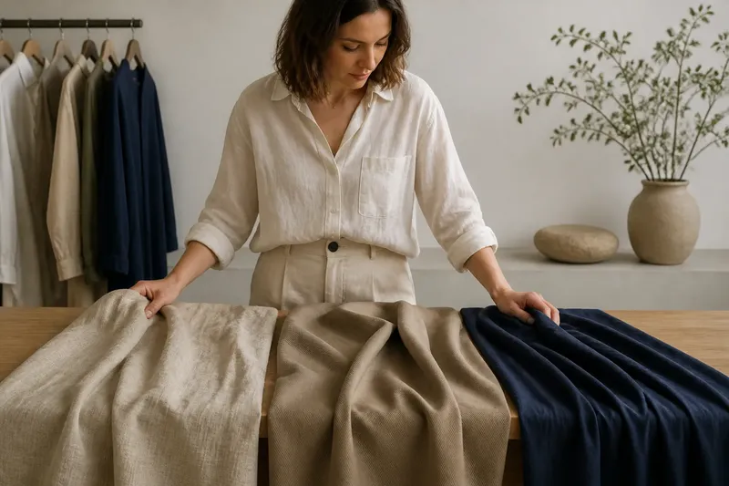
Texture describes how a fabric’s surface looks and feels: brushed, ribbed, smooth, nubby, crisp or lustrous. When garments share a colour but differ in texture, the colour keeps the outfit coherent while the surfaces prevent it from reading as one uninterrupted block.
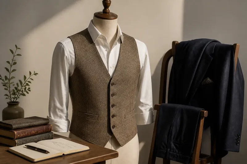
Try thinking in pairs rather than searching for a perfect match. A fine-gauge merino jumper beside wool flannel trousers combines two soft materials, yet the knit’s small loops and the flannel’s gently blurred finish remain distinct. A cotton poplin shirt under a cotton cardigan can work similarly: one surface is crisp and flat, the other visibly knitted.
Contrast does not have to mean opposites. A subtle change from smooth to ribbed may be enough. Too many competing surfaces, by contrast, can make a simple set feel busy. If the main garments already have a pronounced weave, shine or pile, a quieter accessory may add more clarity than another strongly textured layer.
Proportion changes how a set reads
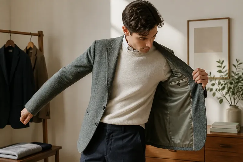
Proportion is the relationship between the size and shape of garments on the body. Two pieces in the same colour can feel more defined if one is close-fitting and the other has room, or if a short layer meets a longer one at a clear point. The contrast gives the outfit a visible outline without requiring a new colour.
For instance, an oversized blazer over a narrow knit top changes the silhouette through volume. A cropped jacket over wide-leg trousers creates another kind of distinction: the upper and lower halves have different lengths and shapes. Neither choice is universally better. The useful question is whether the clothes leave the outline you want to see, rather than whether every piece matches in scale.
Proportion also affects how a colour block is divided. A long cardigan and straight trousers in the same shade may produce a continuous column, while a shorter jacket interrupts it. That interruption can add shape, but it can also draw attention to the point where the layers meet. Look at the full silhouette in a mirror, including shoes and outerwear, before adding more contrast.
Small differences can make a coordinated outfit feel complete
When an exact set feels too uniform, change one quality at a time. This keeps the outfit connected and makes it easier to see what is helping. Consider these adjustments:
- Keep the colour and change the surface. Pair a smooth knit with a ribbed or woven piece in a similar shade.
- Keep the fabric family and change the shape. Balance a roomy top with a straighter lower half, or a compact jacket with fuller trousers.
- Introduce one crisp element. A poplin collar, structured bag or clean-edged belt can stand apart from soft clothing.
- Vary the finish. Put a matte garment beside a subtly lustrous one, rather than adding shine everywhere.
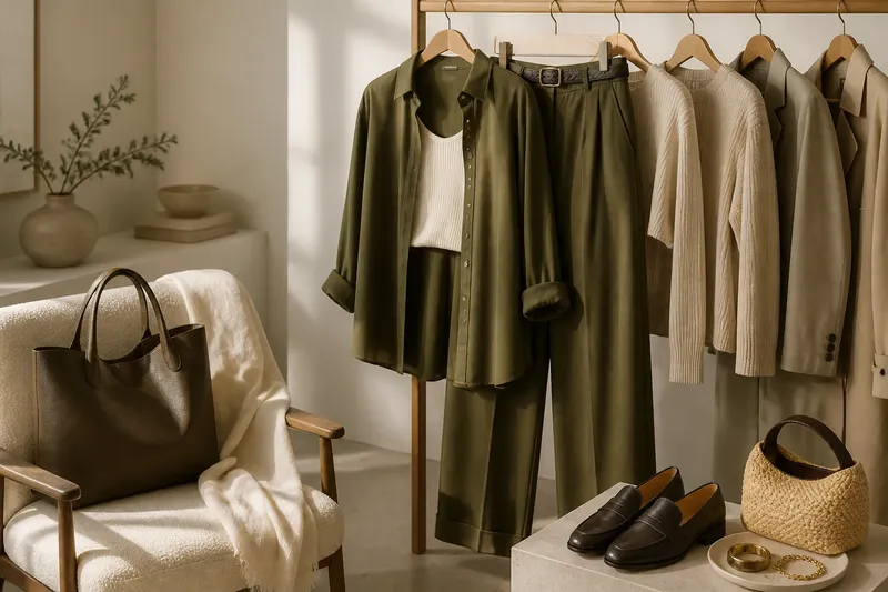
- Use an accessory to separate surfaces. A leather shoe, metal jewellery or woven bag can create a small, legible break.
Say you own a matching olive cotton shirt and trousers that look like a single block when worn together. You could leave the shirt open over a cream vest and roll the sleeves, making the layers and cuffs visible; the expected result is a clear shift in colour and outline while the olive pieces still read as a set. If you prefer to keep the colour continuous, a woven belt or a different shoe texture can make a quieter distinction.
These choices work best when they answer a specific concern. If the outfit feels too soft, add a crisp edge. If it feels shapeless, alter the balance of volume. If the surfaces disappear into one another, choose a material with a more visible finish. Adding contrast for its own sake can distract from the clothes rather than clarify them.
When should you keep an outfit exactly matched?
Can an exact set still look polished?
Yes. A matching suit or co-ord can look deliberate when its cut is clear and the fabric has enough presence to hold its shape. A simple shoe or restrained accessory can support the set without breaking its unity.
How do you add contrast without introducing another colour?
Change texture, finish or proportion while keeping the palette consistent. A ribbed knit with smooth trousers, or a short jacket over a longer top, can create distinction without a new colour block.
How many contrasting textures should you combine?
There is no fixed count; focus instead on whether each surface has a distinct role. If several pieces all compete through heavy texture or shine, let one garment or accessory become the quieter element.
What if the matching pieces are different shades?
Near-matching shades can look intentional when their difference is supported by another connection, such as fabric, finish or silhouette. If the shades seem accidental together, separate them with a neutral layer or choose one piece as the outfit’s main colour.
Read the outfit as a whole rather than a set of matches
When judging a coordinated outfit, step back and notice where the eye lands. Do the garments merge, or can you see their edges, surfaces and shapes? If matching colour is the feature you want, a continuous silhouette may be exactly right. If the result feels flat, let one carefully chosen difference do the work.
The matching outfit myth is not that coordinated clothes should be avoided; it is that exact agreement is enough to create visual interest. Keep the elements that make the set feel connected, then adjust texture or proportion where definition is missing. That small decision can turn a matching outfit from a uniform block into a composed look with its own shape.